")
")
The way we consume information has changed radically in the last two decades. In the age of digital saturation, attention span is measured in seconds, and long, dense text is a liability. Successful brands today have adopted a universal language: the visual language. As Edward R. Tufte, a pioneer in data visualization, advocated, graphical excellence consists of conveying the greatest number of ideas in the shortest time and space possible. Infographics are the digital tool that fulfills this promise.
An infographic is much more than a pretty picture; it is a design piece that combines data, concise text, and illustrations to communicate a message quickly and persuasively. They are the perfect bridge to convey complex or boring information where words alone cannot reach, and they are essential for any modern content marketing strategy.
The Neuroscience Behind the Infographic: Why We Love Them
The effectiveness of infographics is not a passing trend; it is a response to how our brain works. Neuroscientists and psychologists have shown that we are inherently visual creatures. Here is why:
- Processing Speed: The brain processes visual information 60,000 times faster than text. Images are processed in parallel, while words are processed sequentially. An infographic allows for almost instantaneous data assimilation.
- Information Retention: People remember only 10% of the information they hear three days later. If that information is presented with a relevant image, retention can increase up to 65%.
- Direct Emotions: Colors, typography, and shapes have a direct emotional impact. A well-designed infographic can build trust, surprise, or empathy before the reader has even read the first number.
In marketing, this translates into an effective tool for capturing the target audience's attention and encouraging action.
Key Benefits of Infographics for Brands
Infographics fulfill several critical functions within a content strategy, especially for niche brands like Estudio Neobox:
1. Engagement and Shareability
On platforms like LinkedIn, Twitter, or Pinterest, infographics are up to three times more likely to be shared than any other type of content. They are iconic, visual, and a quick tool to educate the audience. This translates into referred traffic and an exponential increase in impressions.
2. Positioning as an Authority
By condensing official statistics, complex studies, and data from recognized institutions into a clean and professional design, the infographic positions you as an expert information curator. You are saying: "I understand this complex topic and I simplify it for you." This indirectly builds brand prestige and authority.
3. Indirect SEO Improvement
Although text is key for traditional SEO, infographics help in two ways:
- Backlinks: When a website (a blog or a magazine) cites your infographic as a data source, they often link directly to your site, creating high-quality backlinks.
- Dwell Time: Attractive visual content increases the time spent on the page, a positive signal for search engines indicating that the user found value.
The Democracy of Design: Infographics with AI and Free Tools
The barrier to creating high-quality visual content has disappeared. Previously, creating an infographic required professional design skills and a lot of time in programs like Illustrator or InDesign. Today, technology has put the power of design into the hands of marketing enthusiasts:
- Canva: Remains the undisputed champion in democratizing design. It offers a vast free library of customizable templates, icons, and fonts that allow professionals to create polished pieces in minutes.
- AI Assistance: Recent tools allow the use of AI to speed up the process. You can ask a generative image AI to create custom icons or thematic backgrounds, or use design assistants that automatically adapt your data to a visual format.
This means that the challenge is no longer technical skill, but Content and Aesthetics. An infographic must be creative, informative, and appealing. If the content is excellent but the aesthetics are poor (hard to read, saturated), it will not be effective. If the aesthetics are perfect but the content is weak, the reader will leave disappointed.
Types of Infographics and How to Use Them
Not all infographics are the same. Choosing the correct format amplifies the message:
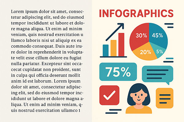
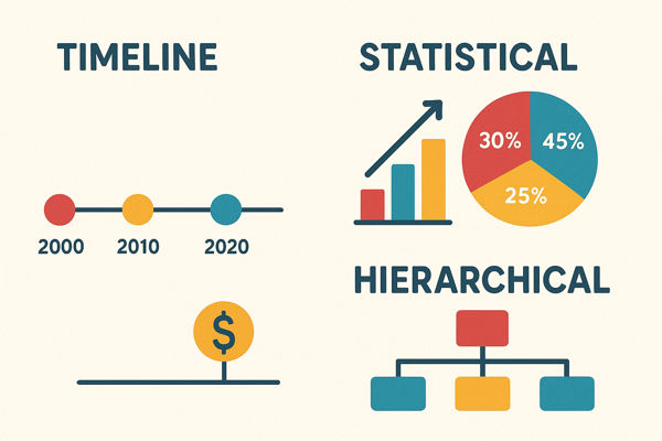
1. Statistical or Data Infographic
Ideal for presenting survey results, product comparisons, or the impact of a trend. It uses pie charts, bars, and large, clear numbers. (Perfect for the Neobox blog).
2. Timeline Infographic
Excellent for narrating your brand's history, the evolution of a technology (like the development of AI), or the steps of a software project. It conveys progress and sequence.
3. Process or Guide Infographic
Shows the steps to achieve something (example: "How to Implement the Pomodoro Technique"). They are very popular because they offer practical value and teach the reader concisely.
4. Geographic or Hierarchical Infographic
Perfect for showing a team's structure, the distribution of a market, or the relationship of different concepts under the same umbrella.
Practical Guide: From Sketch to Virality
Before opening Canva, the key lies in strategic thinking. This will help you finish the piece faster and maximize its effectiveness:
- Define the Purpose: Do you want to inform (hard data), educate (process), or persuade (comparison)? The purpose must be unique.
- Create the Narrative (The Sketch): Make a summary by hand or in a simple document. Include the catchy title, the data source (official statistics, proprietary studies), and the key points.
- Choose the Atmosphere: Define 2-3 dominant colors, making sure they contrast well and are consistent with your brand's visual identity.
- Focus on Minimalism: In visual design, less is more. Eliminate any decorative element that does not directly support the information. Every icon, every line, must have a purpose.
Infographics are ideal for the new marketing—the one that doesn't look like marketing. It's no longer just about imperative ads; it's about value propositions that show the brand cares about its customers, offering them valuable and easy-to-assimilate content. The future of communication is visual, and whoever masters the infographic will dominate online attention.