")
")
If you are designing or redesigning your website, there is one fundamental truth you must accept: typography is 90% of the design. It doesn't matter if you have the best photos or the most innovative menus; if the text is difficult to read, if the font looks outdated, or if it takes forever to load, you will lose your visitors.
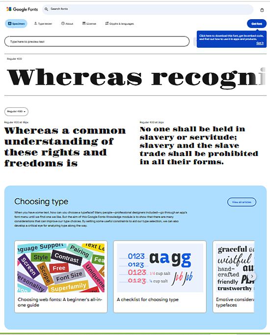
This is where the web design superhero comes into play: Google Fonts. This free library of over 1,500 typeface families has democratized quality on the web. You no longer need to pay hundreds of dollars for professional fonts; you can access them easily and, more importantly, in a way that is optimized for performance.
For Neobox, which focuses on technology and optimization, it’s not just about aesthetics. It’s about how these fonts can help you speed up your site and improve the user experience (UX) on any device.
Let's explore the tricks behind selecting Google Fonts and unveil the 10 best options that will make you look like a pro.
The Speed Secret: Why Google Fonts Are Faster
If you are a beginner, you might wonder why you can't just upload your own fonts. The answer has to do with the Content Delivery Network (CDN).
When you use a font hosted on the Google Fonts server, you are not making the visitor download it directly from your website. Instead, the user's browser downloads it from Google's globally optimized servers. This offers three major technological advantages:
- Global Cache: It is highly likely that the visitor has already downloaded that same font when visiting another website. The browser already has it saved, and your website loads the text instantly! This is a huge benefit for speed (SEO).
- Parallel Loading: The browser can download the font from Google and other files from your server at the same time, without getting stuck.
- File Optimization: Google hosts the fonts in modern, optimized formats (like WOFF2), which are much lighter and faster to download than older formats.
Golden Rule for Neobox: Never use more than two or three different fonts on your website. Every additional font you add is an extra download request that slows down your page.
Legibility Fundamentals: Serif vs. Sans-Serif
Before choosing, you must understand the two major groups. This is a basic design distinction, but crucial for performance.
1. Serif Fonts (With Feet)
- What are they? These are the fonts that have a small "foot" or finish (serif) on the edges of the letters (like Times New Roman).
- Ideal Use: They are traditionally used for print (books, newspapers), because on paper, the serif helps guide the reader's eye along long lines. On the web, they are best used for headings or very short texts that aim for a touch of elegance or tradition.
2. Sans-Serif Fonts (Without Feet)
- What are they? These are the "clean" fonts, without finishes (like Arial or Helvetica).
- Ideal Use: They are the queens of digital content. On screen, sans-serifs are much clearer and more legible, especially at low resolutions and on mobile devices. They are the perfect choice for the body text of a blog or a technology site.
The 10 Best Google Fonts for Optimal Performance
The "best" font is one that achieves a balance between legibility, style, and, above all, good support for different typographic weights (thin, normal, bold, etc.).
Here is the essential list for any Neobox website:
1. Montserrat (Sans-Serif - The Versatile Queen)
- Why is it top? It is modern, geometric, and has a strong personality. It is excellent for headings and is a designer favorite for its wide variety of weights and clean appearance.
- Neobox Tip: Use it for your main headings and combine it with a more classic font for the body.
2. Open Sans (Sans-Serif - The Global Standard)
- Why is it top? One of the most downloaded fonts in the world. It was created by Google with excellent legibility in mind. It is neutral, friendly, and works perfectly in long text blocks.
- Neobox Tip: If you could only choose one font for your entire site, this would be it. It is ideal for body text.
3. Roboto (Sans-Serif - The Android Font)
- Why is it top? It is the official font for Android and the Google interface. It is slightly narrower than Open Sans, allowing more text to fit into a smaller space. It has excellent harmony in its design.
- Neobox Tip: Perfect for websites that want to convey a sense of modernity and pure technology.
4. Lato (Sans-Serif - Friendly and Serious)
- Why is it top? It means "Summer" in Polish. It is a font that feels warm and friendly, without losing professionalism. Its different weights work very well for content hierarchy.
- Neobox Tip: Use it if you are looking for a balance between the friendliness of Open Sans and high-quality design.
5. Poppins (Sans-Serif - For Catchy Headings)
- Why is it top? It is completely geometric (based on perfect circles), which gives it a very distinctive and youthful look. It is fantastic for brand design and large headings.
- Neobox Tip: Do not use it for long texts, as its geometry can tire the eyes. It's a marketing font!
6. Oswald (Sans-Serif - The "Condensed" Font)
- Why is it top? It is a condensed (narrow) font that is ideal when you have limited horizontal space. It maintains clarity and a very contemporary look.
- Neobox Tip: Excellent for top navigation menus or for headings that need to be large but cannot take up the full width.
7. Merriweather (Serif - The Classic Option)
- Why is it top? If you need a serif font that works well on screens, this is the choice. It was designed specifically to be legible on monitors and has a generous letter height.
- Neobox Tip: Use it as body text if your website is about art, culture, or history, where the serif style is more appropriate.
8. Playfair Display (Serif - The Magazine Style)
- Why is it top? It is an elegant serif font, with a marked contrast between thin and thick strokes. It has a touch of luxury or fashion magazine. It is not for the body, but for impressing.
- Neobox Tip: Combine it with a very clean sans-serif (like Open Sans) for the headings. It's a combo that never fails in professional design.
9. Source Sans Pro (Sans-Serif - Created by Adobe)
- Why is it top? It was Adobe's first open-source font. It is an ultra-clean and very professional option, designed to be efficient in the user interface.
- Neobox Tip: It is a more robust and less "friendly" alternative than Open Sans, ideal for technical reports or professional niche sites.
10. Inter (Sans-Serif - The New Favorite)
- Why is it top? Designed for computer and mobile screens, it is one of the most recent fonts and has been optimized for legibility at small sizes. Many designers are adopting it as the new standard.
- Neobox Tip: If you want to be at the forefront of typographic technology, Inter is your best ally for body text.
The Master Trick: Loading "Only What's Necessary"
The biggest mistake a beginner makes is loading all the weights of a font. If you choose Montserrat, Google Fonts allows you to load from weight 100 (Thin) to 900 (Black).
If you only use weight 400 (Normal) and 700 (Bold) on your site, you should only load those two weights.
When loading the font, make sure to uncheck the weights you will not be using. This reduces the font file size by up to 80%, giving a significant boost to your website's loading speed.
Remember: Every millisecond counts for SEO and your visitor's patience. Choosing a good Google Font and, above all, implementing it efficiently, is the real secret to having a professional and fast website.